

2026-07-24 · 12 min read · Graphic Design / AI / Visual Culture
AI Knows Visual Styles We Barely Have Names For
The interesting part of AI graphic design is not its ability to imitate Bauhaus or Brutalism. It is what happens when obscure visual languages collide.
I asked an AI how many visual styles it knew.
The first answer was reassuringly large and almost completely useless: thousands.
That is probably true in the same way that a streaming service contains millions of songs. Quantity says very little about whether the system understands what it contains, how precisely it can retrieve it, or whether it can tell the difference between a genuine visual tradition and a Pinterest moodboard assembled last Tuesday.
So I pushed further.
Not Bauhaus. Not Swiss Design. Not Brutalism, Art Nouveau, Y2K, cyberpunk, minimalism, or the familiar styles that already appear in every prompt guide.
What are the weird ones?
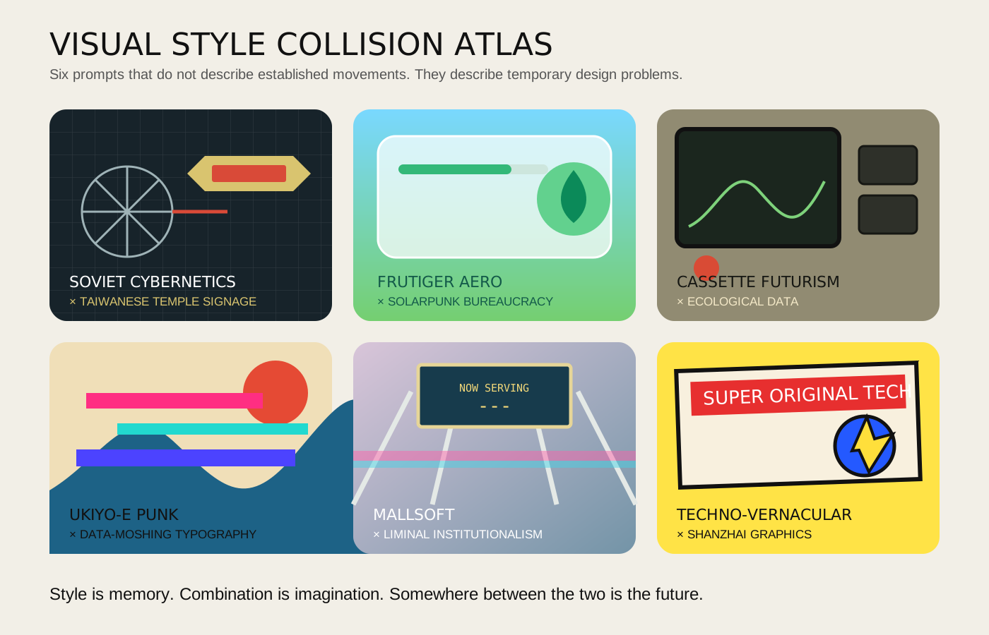
The answer became much more interesting: cassette futurism, mallsoft, signalwave, dungeon synth, Soviet cybernetics, Xerox punk, techno-vernacular, liminal institutionalism, shanzhai graphics, archaeological futurism, solarpunk bureaucracy.
Some are recognized design categories. Some are internet micro-aesthetics. Some are music scenes that produced their own visual language. Some are retrospective labels applied to a period that never used the name itself. Some may only exist because enough people collected similar images into a folder and decided they belonged together.
That ambiguity is not a weakness. It may be the most important thing AI brings to graphic design.
AI is not only learning styles. It is learning the space between styles.
A style is a compressed world
A visual style is rarely just a set of colors, fonts, and shapes.
Cassette futurism contains a whole theory of technology. The future is physical, modular, heavy, covered in switches, labels, vents, warning lights, and beige plastic. A machine reveals what it does because its functions have not yet disappeared behind a sheet of glass.
Mallsoft contains a theory of memory. The shopping mall is not shown as a successful commercial environment but as an emotional ruin. Escalators keep moving. Artificial plants remain green. Music plays for customers who never arrive.
Frutiger Aero contains a theory of progress. Technology is clean, friendly, ecological, bubbly, and compatible with grass, water, fish, clouds, and smiling families. It is the future imagined before platforms became anxious, dark, and permanently optimized.
Soviet cybernetics contains a theory of institutions. Information belongs to diagrams, systems, operators, machines, and the state. It looks scientific even when the science is speculative. It gives abstraction an administrative body.
Techno-vernacular contains a theory of survival. A sign, menu, control panel, repair label, or homemade interface does not need to be elegant. It needs to work in one specific place for people who already understand the situation.
When an AI recognizes a style, it is not necessarily understanding these theories. More often, it is learning the visible evidence left behind by them.
That distinction matters.
The model may know that Frutiger Aero often contains blue skies, glossy surfaces, bubbles, green hills, and optimistic interface elements. It does not automatically know why those things appeared together, what economic period made them plausible, or why they now trigger nostalgia.
But graphic designers also begin by collecting visible evidence. We look at posters, packaging, websites, album covers, public signs, technical manuals, and old interfaces. We learn the repeated moves. We notice what belongs together. Only later do we develop a stronger explanation for why.
AI has performed this first stage at a scale no individual designer could approach.
It has become a badly catalogued visual archive of almost everything.
The archive has strange shelves
Traditional design history is organized around movements, schools, studios, countries, and famous designers.
AI training data is organized much more chaotically.
A museum poster, a fan wiki, an abandoned Tumblr, a product listing, a scanned instruction manual, an airport sign, a bootleg T-shirt, a university archive, and a screenshot from a 2008 operating system can all become neighboring evidence.
This creates a different kind of design knowledge.
The model may not know the official lineage of a style, but it may recognize tiny families of visual similarity that formal history has never named. It can connect things because they look related before anyone has written an essay explaining the relationship.
That makes AI especially good at producing visual collisions.
Not simply “make this in the Bauhaus style.”
More like:
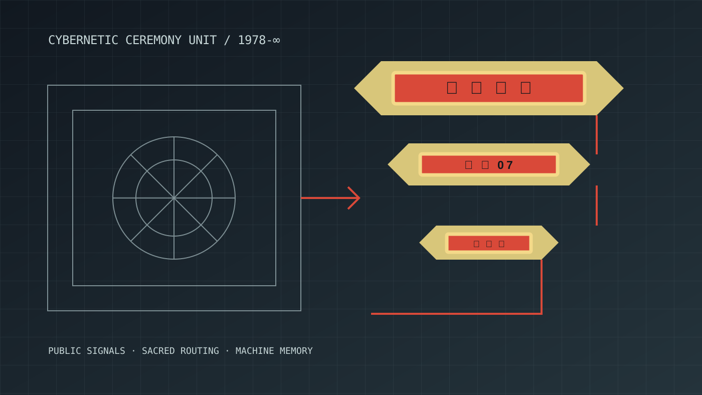
What happens when Estonian Soviet cybernetics meets Taiwanese temple signage?
That prompt does not point toward an established movement. It creates a temporary design problem.
The first style contributes technical grids, diagrams, institutional geometry, restrained machinery, and the feeling that information is being processed by a system larger than the viewer.
The second contributes vertical density, ceremonial color, gold outlines, layered characters, illuminated borders, visual protection, and the feeling that every surface has symbolic responsibility.
The result is neither historically accurate nor culturally neutral. It should not pretend to be. But it may reveal a new visual territory: sacred infrastructure, ceremonial computing, a machine that feels like both a public institution and a temple object.
This is where AI becomes useful for design research.
It can move from retrieving known references to testing unknown combinations.
Frutiger Aero becomes a government office
Frutiger Aero is usually remembered as a cheerful commercial style: blue skies, green fields, glass, water, bubbles, fish, leaves, and optimistic technology.
Solarpunk is also optimistic, but it is usually depicted through architecture, community gardens, renewable energy, and speculative cities.
Bureaucracy is rarely included in either fantasy.
Yet every ecological future will require forms, standards, maintenance schedules, public dashboards, inspection systems, permits, maps, budgets, and institutions. Solar panels do not organize themselves. Clean water does not remain clean because a moodboard looked hopeful.
So what would solarpunk bureaucracy look like?
A public-service interface that treats ecological systems with the same visual importance that governments currently give taxation, transport, or border control. A municipal form that is genuinely pleasant to use. A water-quality dashboard that feels like the future was designed for ordinary people rather than presented to them at a conference.
Frutiger Aero supplies the emotional optimism. Public-service design supplies structure. Solarpunk bureaucracy supplies the political question: who maintains the good future after the concept art is finished?

The combination looks strange because we are used to imagining good futures without their administrative layer.
That absence is itself a design failure.
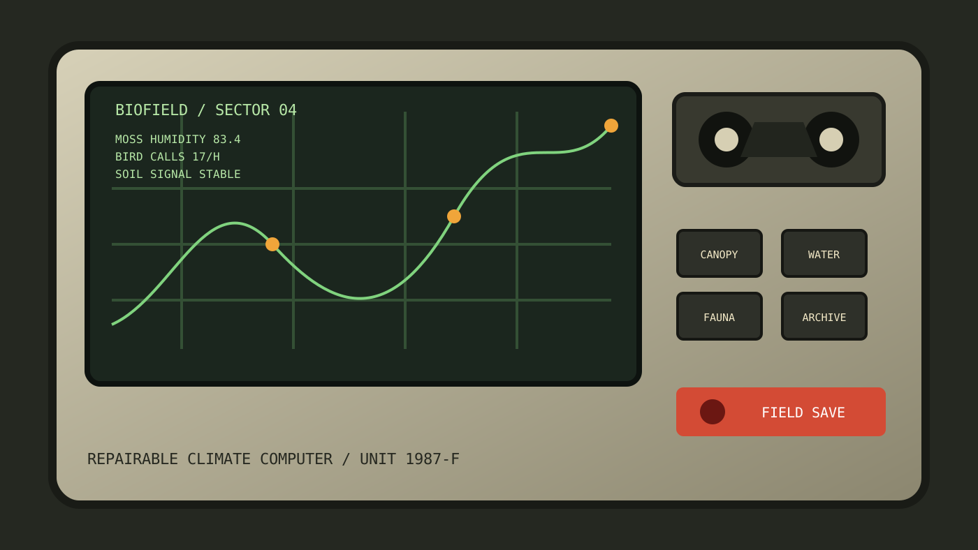
Cassette futurism starts measuring the forest
Cassette futurism imagines advanced technology through the industrial vocabulary of the late twentieth century.
The machine has a handle. The screen is small. The buttons have one function each. Data arrives as lines, numbers, grids, and blinking indicators. Nothing is frictionless because friction is how the operator knows the machine is responding.
Ecological data visualization usually moves in the opposite direction. It tries to compress complexity into clean charts, maps, and dashboards. The equipment disappears. Only the information remains.
Combining the two produces a field instrument from a future that never happened.
A forest monitoring terminal with replaceable modules. A biodiversity computer that looks repairable. A climate interface that exposes uncertainty instead of smoothing it into a single score. A machine designed for a scientist wearing gloves in rain, not a stakeholder reviewing a deck.
This is not automatically better design.
Physical controls can become decoration. Complexity can become theatre. A machine can look trustworthy because it resembles an instrument even when the information is meaningless.
AI is very good at producing the appearance of operational seriousness.
That is one of its dangers.
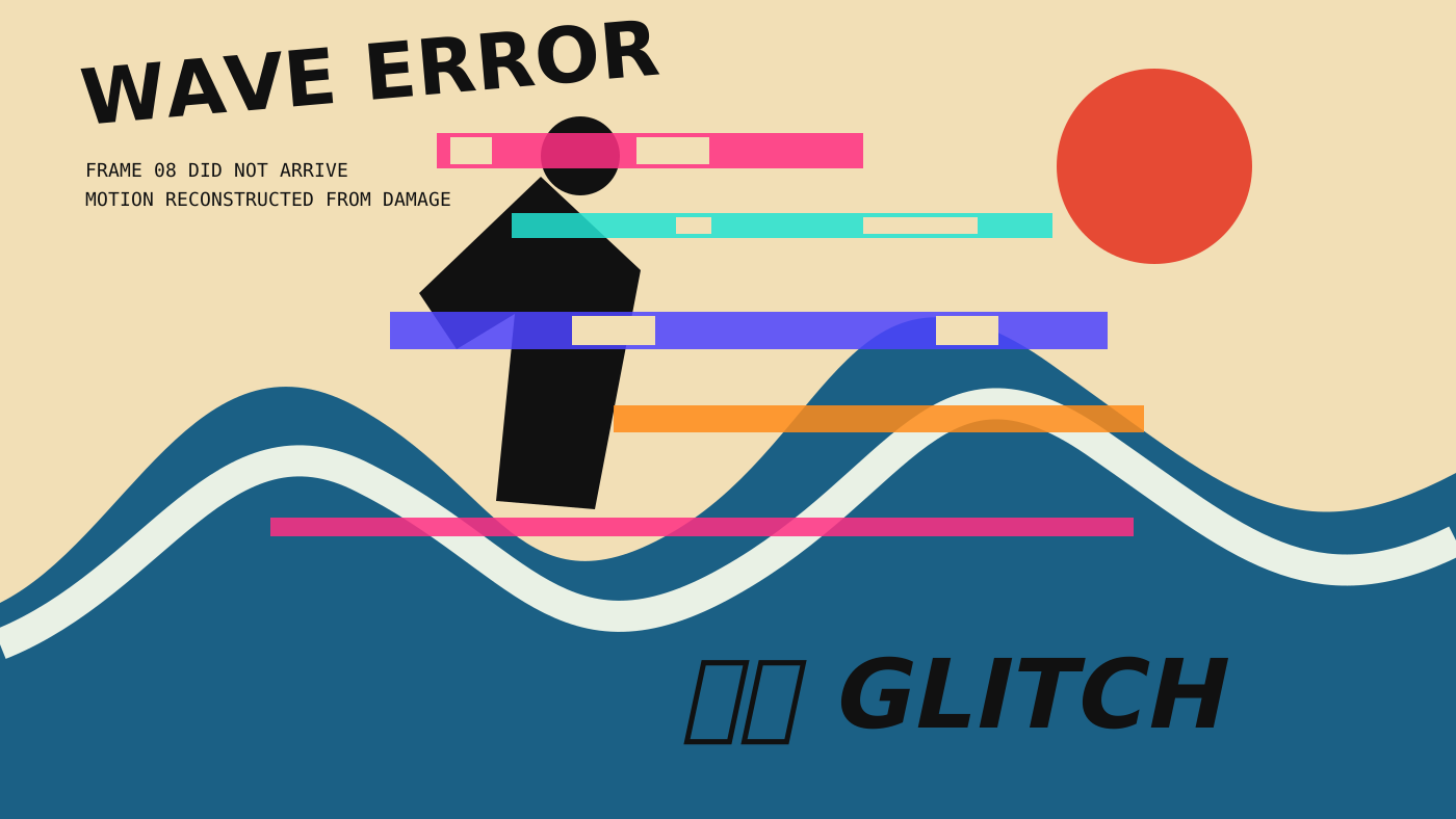
Ukiyo-e gets corrupted by a broken video file
Ukiyo-e and data moshing should have almost nothing in common.
One is associated with controlled line, flat color, deliberate composition, printing constraints, landscapes, actors, weather, waves, and carefully framed motion.
The other emerges from damaged digital video, compression errors, displaced blocks, frames leaking into each other, and information failing to update correctly.
One turns motion into an image. The other turns a failed image into motion.
Together they create a useful tension.
The composition remains legible, but parts of it begin to slide, repeat, tear, and misregister. The wave becomes a compression artifact. The actor becomes several frames at once. The title behaves like damaged broadcast information.
This kind of combination shows why style prompts should not only describe appearance.
They can describe a conflict.
Stable versus unstable.
Handmade versus compressed.
Ceremonial versus disposable.
Institutional versus improvised.
The conflict gives the image a reason to exist.
Mallsoft enters the public sector
Mallsoft is usually presented as empty commercial architecture: food courts, fountains, carpet, polished stone, fake plants, skylights, escalators, and music that continues after the economic purpose has disappeared.
Liminal institutionalism expands the same feeling into airports, schools, hospitals, offices, conference centers, and waiting rooms.
Signalwave adds another layer: degraded television graphics, station IDs, weather maps, public announcements, and transmissions that feel as if they are arriving from a place where the normal schedule has quietly ended.
Together they create an interface for an institution that may no longer exist.
The screen still says “please wait.”
A number is still being called.
The directory still lists departments.
The system appears operational, but nobody can confirm what it is operating.
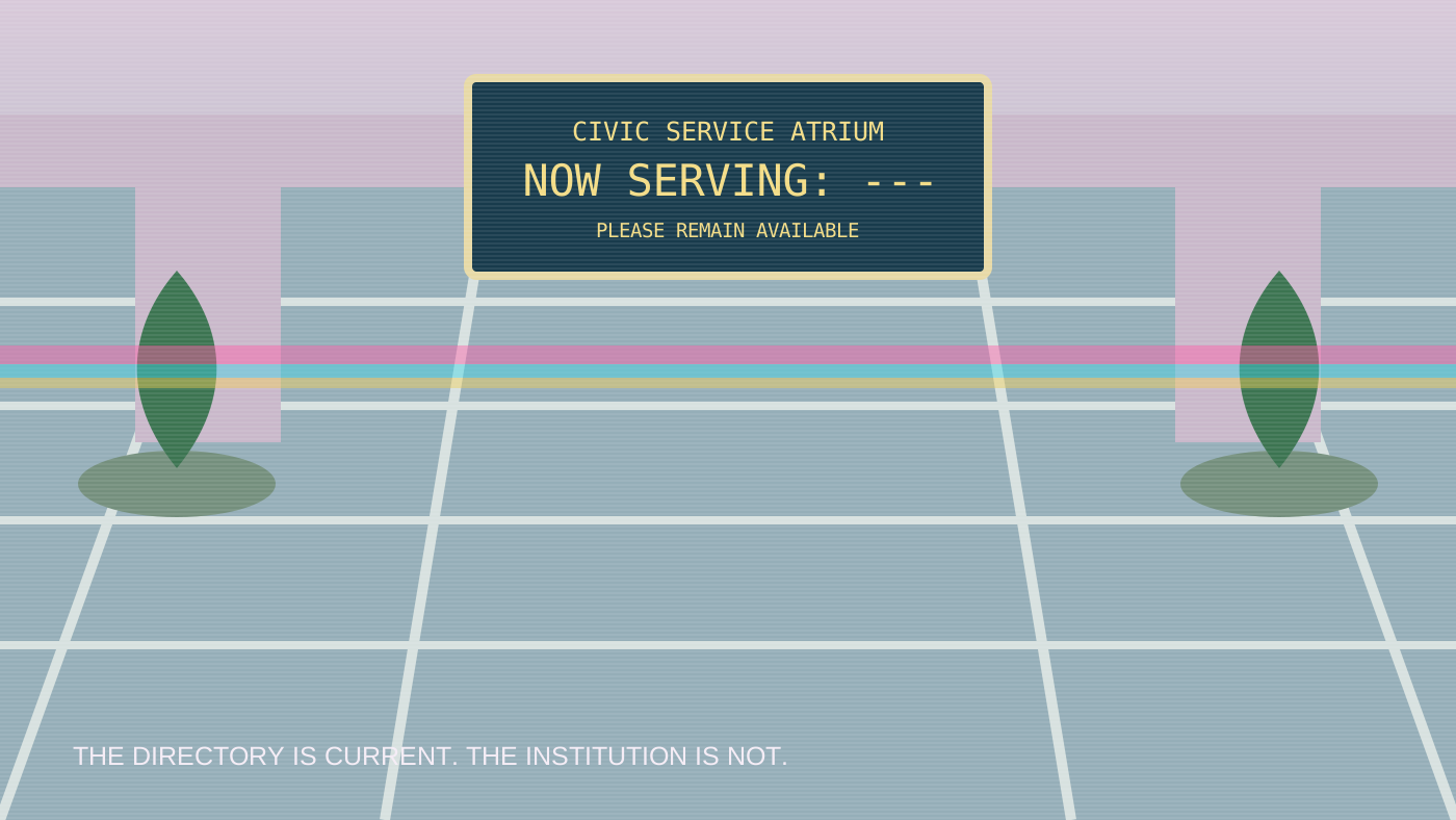
This is more than an aesthetic of empty spaces.
It is an aesthetic of systems continuing after meaning has left.
That feels increasingly relevant to contemporary digital products. Interfaces remain online after teams disappear. Support forms keep accepting requests. Automated emails keep promising a response. Dashboards stay green because the metric that would reveal failure was never added.
The abandoned mall and the abandoned software product are not very far apart.
Shanzhai design reveals how brands are actually read
Shanzhai graphics are often described as imitation, piracy, counterfeiting, or low-quality copying.
Visually, they can be much more complicated.
A familiar logo is redrawn from memory. English words are rearranged without concern for their original meaning. Luxury signals are combined with sports graphics, cartoons, flames, gradients, technical labels, and local sales language. Brand identity becomes a box of parts rather than a protected system.
Techno-vernacular design works similarly, but usually without pretending to be a global brand. It appears in repair shops, street menus, local transport, handmade labels, market stalls, control panels, and improvised public information.
Both expose something professional branding tries to hide: people do not experience brands as perfectly controlled systems.
They remember fragments.
A shape. A color. A rhythm. A vaguely technological word. The idea of speed. The idea of foreignness. The idea of quality.
Then they rebuild the brand from those fragments for a new purpose.
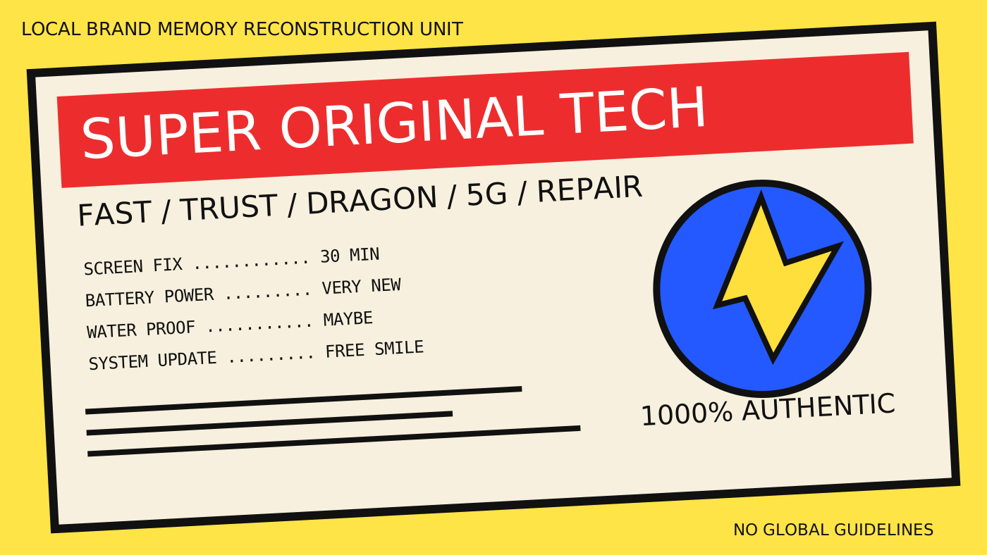
AI does the same thing at a much larger scale.
It does not retrieve a complete brand essence. It predicts the fragments that usually travel together.
That is why generated designs can feel recognizable without being correct.
The most interesting styles may not exist yet
When people discuss AI and graphic design, the conversation often collapses into two positions.
AI can imitate everything, so design is over.
AI does not truly understand anything, so it is useless.
Both positions miss the more interesting possibility.
AI may become a visual search instrument for styles that have not stabilized enough to receive names.
A designer can ask for the wrong combination, study why it fails, change one ingredient, intensify a contradiction, remove the obvious references, and repeat. The output is not the design. It is evidence from a search process.
This changes the role of visual style.
A style no longer needs to be selected from a menu.
It can be constructed as a hypothesis.
What would a climate adaptation office designed by a rave collective look like?
What would a Taiwanese night-market interface look like if it had been standardized by a Nordic transport authority?
What would a biotech company look like if it rejected both sterile minimalism and science-fiction neon?
What would Estonian public infrastructure look like if it acknowledged both Soviet technical history and contemporary digital administration instead of pretending one replaced the other cleanly?
These are not prompts for decoration.
They are questions about institutions, memory, technology, and power expressed through visual form.
The danger is fake depth
The AI can generate a convincing surface long before anyone has decided what the design means.
That makes style collisions seductive.
Add a grid, some degraded type, a diagram, ceremonial symbols, archival noise, and a strange interface label. The result immediately appears researched. It feels as though it belongs to a world with history.
But the world may be empty.
The generated image can contain the visual residue of culture without any responsibility toward the culture. It can borrow sacred forms as texture. It can turn political history into atmosphere. It can compress a living regional language into a reusable aesthetic token.
This is where the designer has to return.
Not to protect a mythical purity of human creativity, but to ask better questions.
Why these references?
What relationship is being proposed?
What becomes visible through the combination?
What is being flattened?
Who would recognize the source differently?
Could the design survive outside the image?
Would it still work as a poster, interface, sign, publication, identity, or service?
AI can make a visual collision in seconds. Design begins when someone takes responsibility for the collision.
AI does not know styles. It knows neighborhoods.
Maybe “style” is the wrong unit.
AI appears to work more like a map of visual neighborhoods.
Some neighborhoods have official names and well-documented histories. Others are connected by informal paths: similar textures, recurring color relationships, shared technologies, overlapping subcultures, copied layouts, regional habits, and platform algorithms.
Prompting moves through this map.
“Bauhaus” takes us to a famous central district.
“Cassette futurism” moves farther out.
“Estonian Soviet cybernetics mixed with Taiwanese temple signage” asks the system to build a road between places that were never supposed to connect.
Most of these roads will lead nowhere.
Some will produce visual nonsense.
A few may reveal that the distance between two styles was smaller than we thought.
That is the part of AI graphic design I find genuinely exciting.
Not that it can reproduce every style we already know.
That it can help us search for the ones we have not learned to see yet.
Connected reading
- AI Can Make the Screenshot
- The Interface as an Archaeological Site
- The Internet Is a Studio Wall
- The Infinite Canvas Is No Longer the Hard Part
AI authorship note
This essay began with Kris Haamer asking how many visual styles AI knows, then pushing past familiar design movements toward obscure aesthetics and unexpected combinations. AI supported drafting, editing, visual exploration, and implementation. Kris selected the collisions, shaped the argument, and approved the final article for publication. The six visual studies were generated specifically for this article as original SVG compositions rather than copied historical examples.