

2026-08-15 · 9 min read · Raw Drafts / Interaction Design / Social Software / Product Strategy
Bumble Gave Me More Time and Somehow It Feels Dead
Bumble stretched its match timer from 24 to 72 hours. The change may improve conversation completion while quietly removing the urgency that made a match feel like an event.
I opened Bumble after the update and something felt wrong. Nothing was broken. The profiles were there, the matches were there, the messages still worked. Bumble had actually given me more time.
And somehow the app felt deader.
This week Bumble changed one of the small rules that used to define the whole rhythm of the product. The window for starting or responding to a new match went from 24 hours to 72 hours, and the company also removed the old rule that made women initiate heterosexual conversations. Bumble says people wanted more flexibility and less pressure. In tests, the company says more conversations were initiated, fewer chats expired, and more conversations became mutual. Reuters reported the change on August 11, and The Verge described the same 24-to-72-hour shift.
Those results sound good. They may even be good.
But they are measuring something different from what I felt.
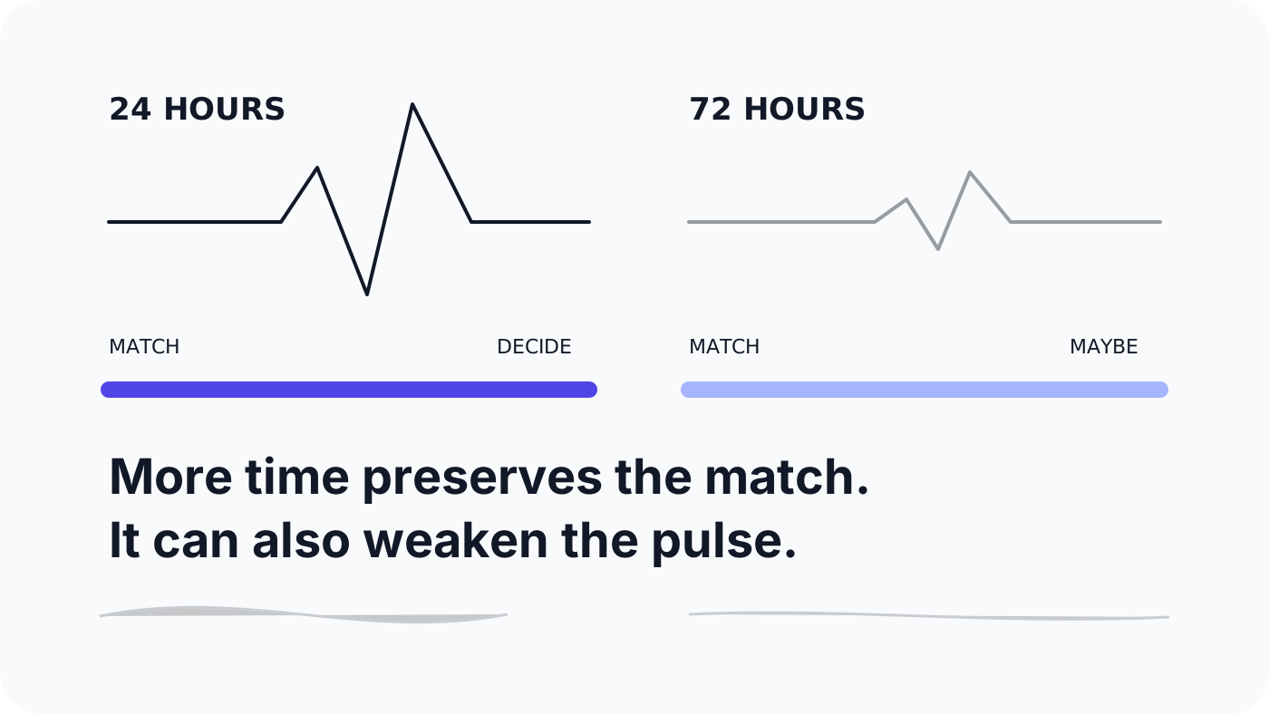
The old Bumble had a very simple temporal structure. A match happened, then something had to happen soon. The timer was annoying because it was supposed to be annoying. It turned a match from a piece of stored information into an event.
We matched now. Are we going to do anything about it?
Twenty-four hours was arbitrary. It punished people for being busy, sleeping, travelling, working, forgetting to check the app, or simply not wanting their dating life to operate like an airport connection. There were obvious reasons to make it more forgiving.
But the timer was doing another job at the same time. It was giving the match a heartbeat.
A Bumble match used to contain a small amount of danger. It could disappear. That meant I had to decide whether I cared while the feeling of matching was still fresh. If I did nothing, the system eventually cleaned up my indecision for me.
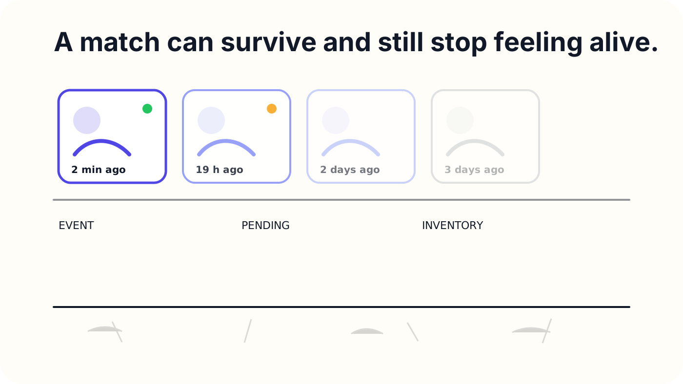
With 72 hours, that same match can sit there for most of a working week. If a reply gets its own 72-hour window, the distance between matching and discovering whether there is actually a conversation can stretch much further. The match survives, but survival is not the same thing as life.
A match can become inventory
This is the part that product metrics can miss.
Imagine two versions of the same dating app. In the first, half of all matches expire quickly, but the ones that survive turn into conversations almost immediately. In the second, almost no matches expire, but the inbox slowly fills with people who may or may not speak to each other sometime this week.
Which product is healthier?
A dashboard might prefer the second one because the expiration rate is lower and the number of eventual conversations is higher. A person opening the app might prefer the first because the social environment has clearer signals about what is actually happening.
The first product has more loss. The second has more inventory.
Software has spent years teaching us that loss is bad. Never lose your work. Never lose a file. Never lose a draft. Never lose a customer. Never lose a match.
Usually this is correct. But social products are strange because removing all possibility of loss can remove urgency, and urgency is one of the forces that makes a social situation feel present.
A concert that can be replayed later is not the same experience as a concert happening in front of you. A café that closes at ten changes what nine-thirty feels like. The person you meet at a party will eventually leave. You can miss them.
That possibility changes behaviour.
Bumble's old timer accidentally gave digital dating some of this physics. The match existed in time, not only in a database.
Some friction is the product
Product design has a very strong instinct to remove friction. Fewer steps. Fewer deadlines. Less pressure. Less waiting. More completion.
There is a good reason for that instinct. Most friction is useless. A broken form, confusing payment flow, inaccessible button, slow page, or pointless confirmation step does not become profound just because it is inconvenient.
But some friction is structural.
A queue can communicate demand. A price can limit waste. A deadline can coordinate people who would otherwise never act at the same time. A turn-taking rule can keep one loud person from occupying the whole conversation. A closing time can create a shared evening.
Remove the friction and you may remove the behaviour it was producing.
This is why I think products have physics.
They contain forces that are not visible as features: scarcity, latency, reciprocity, decay, embarrassment, effort, risk, commitment, visibility, interruption. The interface exposes some of those forces and hides others. People adapt to them.
Then a product team changes what looks like one parameter.
`expires_at = 24 hours`
becomes
`expires_at = 72 hours`
The database sees a number.
The person feels a different social world.
The wrong success metric can make the change look obviously correct
Bumble says its tests produced more initiated chats, fewer expirations, and more mutual conversations. Those are useful outcomes. They are not enough to tell us what happened to the tempo of the app.
If you triple the amount of time available before something expires, it would be surprising if expiration did not fall. The interesting questions begin after that.
How long does it now take from match to first message? How long from match to mutual conversation? What percentage of matches become reciprocal within one hour, six hours, 24 hours, 72 hours? How many pending matches does an active user accumulate? How old is the median unanswered match? Does a slower start lead to deeper conversations, more dates, or simply more technically successful chat initiations?
I would also want a metric that is harder to put on a dashboard:
What percentage of the people in my inbox do I currently perceive as alive?
That is not the same as asking whether a row still exists in the database.
A cemetery has very low churn.
Hinge is solving almost the opposite problem
The contrast with Hinge is useful because Hinge has been explicitly trying to prevent people from accumulating unanswered conversations.
Its Your Turn Limits feature stops people with too many unanswered messages from making new connections until they either reply or end existing conversations. Hinge says unanswered matches were one of the biggest problems it heard from daters, and that testing the limit increased responses.
The product philosophy is almost the reverse of giving every pending connection more time.
Bumble says: take longer, the match will remain available.
Hinge says: deal with the people already waiting before collecting more people.
Neither rule is universally correct. Someone can genuinely need three days before replying. Someone else can genuinely use endless availability as permission to postpone every social decision.
But Hinge is recognizing something important: abundance can create neglect.
A dating app is not necessarily better when it lets me keep more people in an unresolved state.
Bumble is changing this while the company itself is under pressure
The timing matters, although I do not think the financial numbers explain the design decision by themselves.
In Bumble's first-quarter 2026 results, revenue was down 14.1 percent year over year and total paying users were down 21.1 percent. The company described this as part of a deliberate reset of the member base and said it was preparing a reimagined Bumble experience.
So this is not a mature product making a random cosmetic adjustment. Bumble is actively searching for a new interaction model while user fatigue has become a problem across dating apps. Business Insider described the current identity problem as Bumble losing its "Bumble-ness", because women messaging first and the short timer were two of the clearest things that made Bumble feel different.
I am less interested in whether Bumble should preserve every founding feature forever. Products should change when the people using them change.
The interesting question is whether the company knows which pieces are branding and which pieces are physics.
The yellow color is branding.
A disappearing match is physics.
I would keep the 72 hours and bring back the 24
The answer does not have to be returning to the old hard expiration.
I would separate the social rhythm from the data retention rule.
For the first 24 hours, a new match could feel visibly live. Bright, recent, present. This is the moment when the app should communicate that another person is here now.
After 24 hours, the match could fall asleep rather than die. It remains recoverable through the longer 72-hour safety window, but the interface changes its state. The system is no longer pretending this is equally fresh.
After that, archive it instead of dramatically deleting it. Let either person deliberately revive it later if they actually care.
And if I accumulate too many unanswered people, borrow Hinge's idea. Stop giving me an infinite supply of new possibilities until I deal with some of the human beings already waiting in the queue.
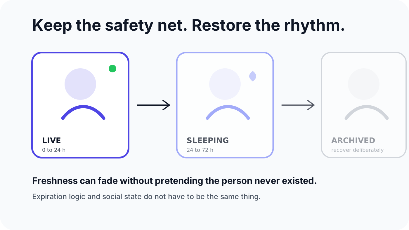
This keeps the humane part of Bumble's change. A busy weekend does not erase someone I wanted to talk to. Missing one day is not treated as moral failure. The product becomes more forgiving.
But it preserves something the old timer understood.
Time itself is part of the interface.
The countdown was never only determining when a database row should disappear. It told me what kind of moment I was in.
That is why the new Bumble can produce more conversations and still feel less alive. The company may have improved the probability that a match eventually becomes a chat while weakening the feeling that anything needs to happen now.
Those outcomes can coexist.
We keep designing software so nothing can be lost, nothing needs an immediate decision, and nobody feels pressure. Then we wonder why everything starts to feel like storage.
Bumble gave me more time.
What I seem to have lost is the moment.
AI authorship note
This essay began with Kris Haamer opening Bumble after the August 2026 timer change and noticing that the app felt unexpectedly dead despite giving matches more time. Kris identified the central interaction-design question: whether the 24-hour limit had been functioning as social rhythm rather than merely expiration logic. AI supported current-source research across Bumble coverage, company results, and Hinge's contrasting response-limit design, drafted and revised the essay, and produced the SVG illustration concepts. Kris shaped the observation, argument, voice, title, and publication decision.