

2026-07-19 · 8 min read · Raw Drafts / Interfaces / Culture
The Interface Is a Secret Handshake
Some products create belonging by making fluency earned. Snapchat, Discord, Twitch, and other insider interfaces turn gestures, rituals, and hidden meanings into culture.
Most interfaces are judged by how quickly a new user can understand them. Buttons should be labelled. Navigation should be visible. Important features should be discoverable. A person opening an app for the first time should not need a friend sitting beside them explaining where everything is.
Snapchat breaks almost all of these rules.
It opens to a camera instead of a feed. Entire sections of the app live behind swipes that are not clearly signposted. Long presses reveal actions that users may never discover. Colours, arrows, flames, rings, and Bitmoji combinations carry meanings that become obvious only after someone has spent enough time inside the product.
For a new user, Snapchat can feel badly designed. For an experienced user, it can feel extremely fast.
That difference is the interesting part. Snapchat is an interface you become fluent in.
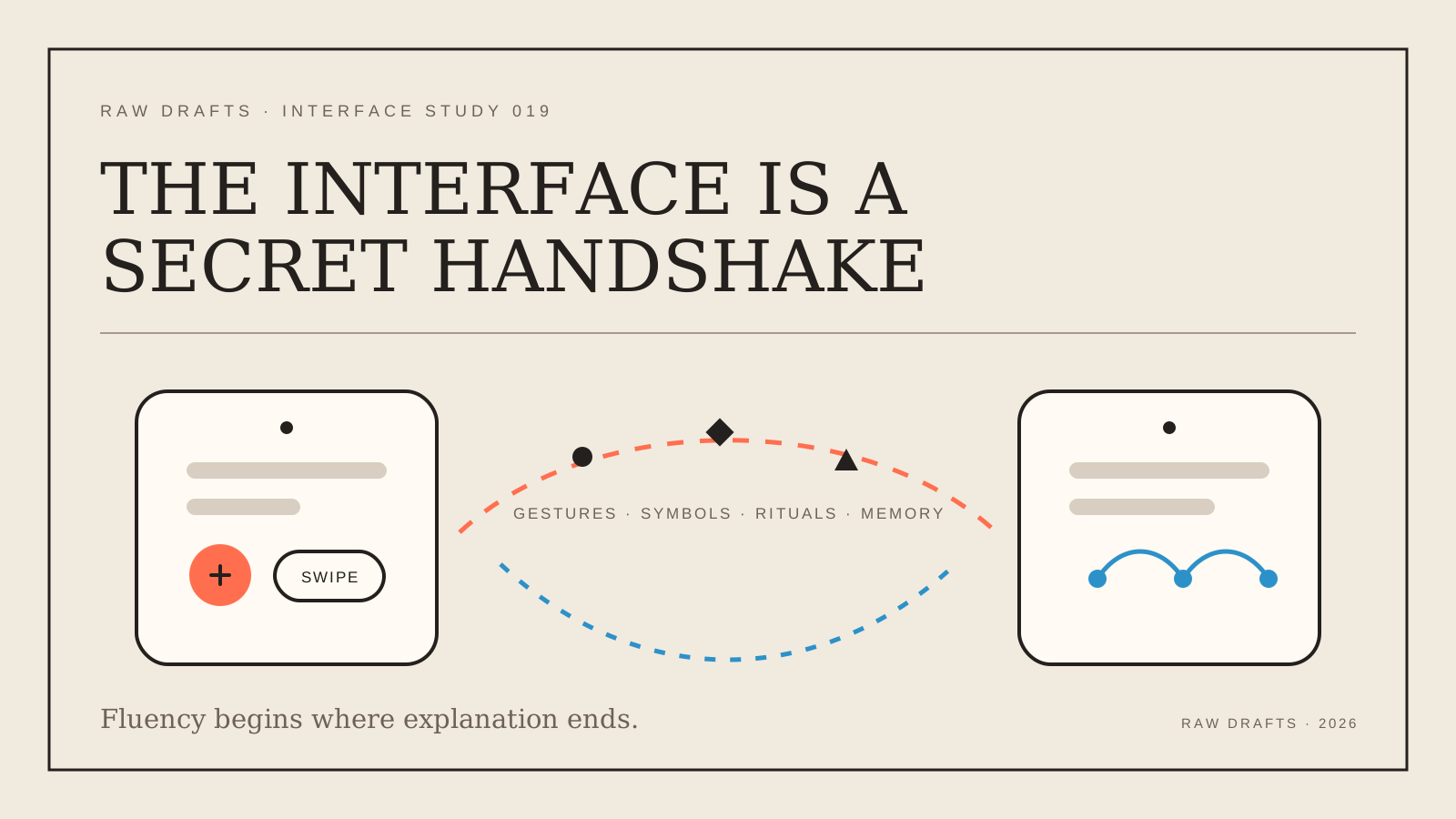
Once you know it, you stop reading the screen and begin moving through it from memory. Swipe right for messages. Swipe left for Stories. Swipe up for Memories. Tap, hold, drag, send. You recognise the difference between delivered and opened without consciously interpreting the symbol. You understand what a streak means, why it matters, and what it means when it disappears.
The interface becomes less like a website and more like a language.
Ease of use is not the same as fluency
A product can be easy to start without becoming especially rewarding to master. TikTok is the obvious example. Open the app and swipe upward. The basic interaction is understood almost immediately.
Snapchat works differently. Its value increases as the user learns more of its grammar.
This is close to what happens in Discord. A new user sees servers, channels, threads, roles, reactions, and bots. Someone who has been using Discord for years sees a legible social structure. They understand where a conversation belongs, which role has authority, what a reaction means inside that particular community, and whether a voice channel is open for anyone to join.
The same thing happens on Twitch. The interface itself is not especially difficult, but the communication inside it is compressed into emotes, repeated phrases, badges, and channel-specific jokes. An outsider sees an image being spammed hundreds of times. An insider reads the emotional state of the room.
Strava builds a more subtle form of fluency. A casual user sees a person who went running. An experienced runner sees pace, distance, elevation, route choice, training load, segment performance, and whether the title “easy morning run” is being slightly dishonest. The interface contains social meaning that becomes visible only to people who understand the activity.
These products do not merely have features. They have dialects.
Friends teach the real interface
Traditional onboarding assumes that the product should explain itself. Insider-fluency products are often learned socially.
A person does not discover every Snapchat behaviour through tooltips. Someone sends them a Snap. They notice the message disappears. A friend tells them to swipe somewhere. They lose a streak and understand its value only after the loss. They see other people using Bitmoji, private Stories, location sharing, or a particular Lens and gradually copy the behaviour.
The social group becomes the onboarding system.
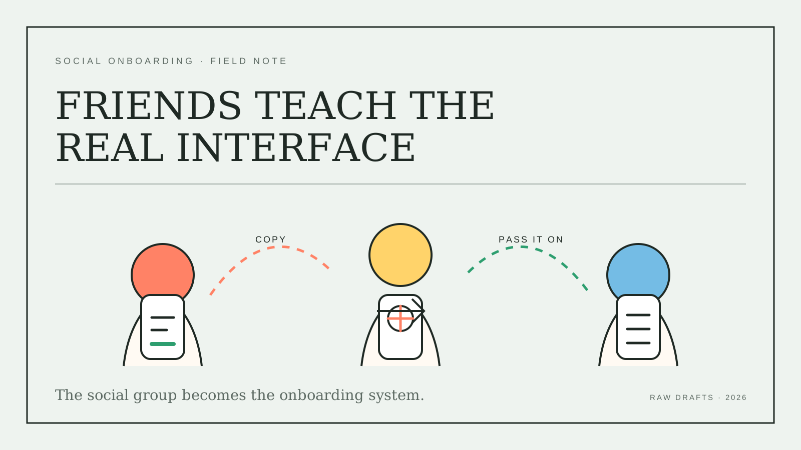
This is partly why products like Snapchat can feel generational. Younger users are not necessarily better at understanding confusing icons. They are simply more likely to have friends who already know the product. The knowledge travels through peer groups.
An older person joining alone has to decode the interface as a piece of software. A teenager joining because everyone in their class already uses it learns the interface as part of entering the group.
The difference is huge.
One person asks, “What does this button do?”
The other asks, “What are my friends doing here?”
The second question is much more powerful.
Confusion can create belonging
Designers usually treat friction as something to remove. But not all friction is purely negative.
Learning an interface can create a feeling of competence. Recognising an obscure symbol can make someone feel like an insider. Knowing how to navigate a product without visible instructions creates the same satisfaction as understanding local slang, ordering from an unofficial menu, or knowing which unmarked door leads to the good room.
The difficulty becomes a small initiation ritual.
This does not mean Snapchat was designed as an intentional test to keep adults out. The more interesting point is that limited discoverability can produce social boundaries even without a formal gate.
The people who know feel at home. The people who do not know become conscious that they are outside.
That can strengthen retention because leaving the app means abandoning more than a feature set. It means abandoning a language the user has already spent time learning, along with the relationships and rituals attached to it.
A streak has no technical value. It does not unlock better messaging. But once two people have maintained one for hundreds of days, it becomes a shared object. The number is part of the relationship.
The interface has turned repeated behaviour into culture.
The risk is mistaking bad UX for community
There is an obvious danger here. A confusing product is not automatically culturally rich.
Sometimes a hidden feature is simply a hidden feature. Sometimes an unexplained icon is just poor communication. Sometimes complexity accumulates because teams keep adding new surfaces without reconsidering the original structure.
Snapchat now contains several different products inside one shell: private messaging, a camera, Stories, a creator platform, an algorithmic video feed, a map, an archive, augmented reality, and an AI chatbot. The spatial navigation that once made the app feel compact now has to carry far more than it was originally designed for.
Insider fluency can conceal these problems. Long-term users know how to work around them, so the interface still feels natural to the people the company hears from most.
This is similar to an old internal tool that employees describe as efficient because they have memorised all its strange behaviours. Their fluency is real, but it does not prove the underlying design is good.
There is a difference between depth and obscurity.
Depth rewards learning by giving the user more control, speed, expression, or social meaning. Obscurity merely requires learning before the product becomes usable.
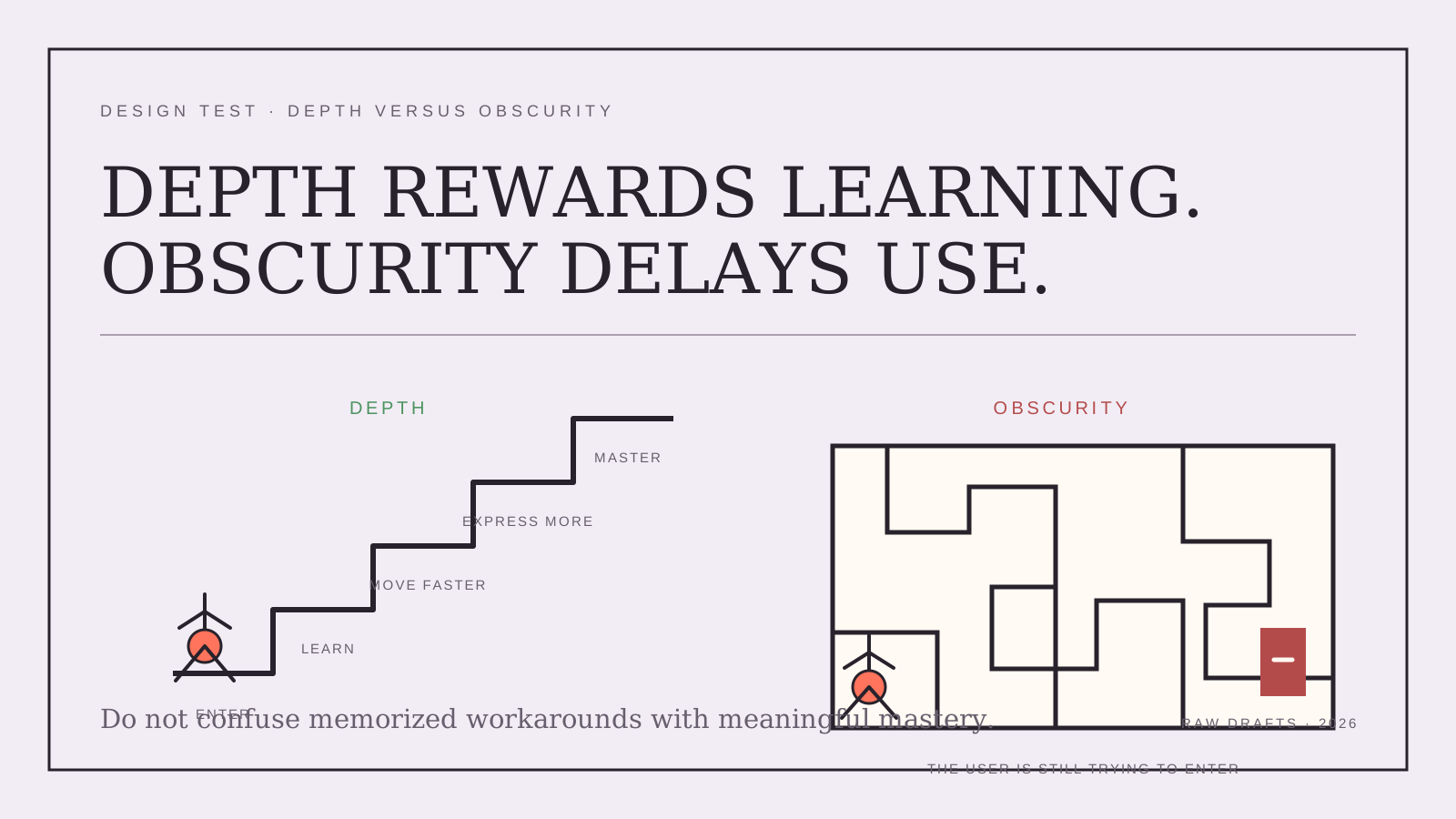
The best insider interfaces offer both levels. A newcomer can participate immediately, while an experienced user can move faster, communicate more precisely, and notice meaning that was previously invisible.
Products need a public language and a private language
Most products concentrate entirely on the public language: clear labels, predictable navigation, familiar interaction patterns, and a short path to the first useful action.
That is necessary, but it may not be enough to create attachment.
The products people inhabit for years often develop a second language. It can be made from keyboard shortcuts, community rituals, metrics, emojis, gestures, status markers, or conventions that are never completely written down.
Figma has this. A beginner can draw a screen. An experienced designer can tell whether the file has been constructed properly by examining its components, variables, constraints, and auto layout. The visible output may be identical, but the underlying grammar reveals who understands the tool.
Linear has it. A beginner clicks through issues. An experienced user navigates and edits the workspace through keyboard commands without breaking their flow. The interface becomes faster as it is memorised.
Roblox has it at several levels. Users learn the platform, then enter individual experiences with their own economies, customs, status systems, and vocabularies. The platform supplies the infrastructure. The community supplies the dialect.
In each case, expertise changes what the user can see.
This may be the more useful way to think about product learning. The goal is not always to make the entire product instantly obvious. The goal is to make the first action clear, then give the interface enough depth that fluency continues to feel valuable.
A good product should not force people to complete a puzzle before they can enter. But it may give them a richer world once they learn how to move inside it.
Snapchat’s interface is difficult to explain because part of it does not really exist on the screen. It exists between the screen, the user’s memory, and the behaviour of their friends.
The interface is not only navigation.
It is a secret handshake.
AI authorship note
This essay grew from Kris Haamer’s analysis of Snapchat’s current interface and a broader question about products that reward insider fluency. AI supported the comparison across social and professional apps, the article structure, drafting, editing, SVG illustration design, and implementation. Kris chose the central argument, directed the Raw Drafts framing, and made the decision to publish it.